NaN Jaune Midi Medium
--font-display / --font-heading — hero lines, section titles, editorial emphasis.
Display · --fs-2xl (36px)
Display headline
Color, type, spacing, and components used across madhurimaram.com.
Semantic palette and foundation ramps from colors_and_type.css — COSS-aligned tokens over grass/gray/lime/yellow/mauve scales.
Semantic tokens
| Token | Maps to | Use |
|---|---|---|
--background | #FAFAFA | Page canvas — never hardcode page bg |
--foreground | var(--gray-12) | Primary text |
--muted-foreground | var(--gray-11) | Labels, decks, meta |
--card / --secondary | white / var(--gray-2) | Panels and muted fills |
--primary | var(--grass-11) | Footer band, deep accent |
--accent | var(--grass-9) | Interactive highlights |
--border | var(--gray-5) | Dividers, frame outlines |
--ring | var(--lime-9) | Focus rings |
--footer-band-bg | #F7F9F8 | Light footer band above dark band |
--modal-scrim-bg | #0A3C14 | Project popup overlay scrim (deep brand green) |
Foundation ramps
Steps 1–12 per ramp. Prefer semantic tokens in components; use ramps for tints and domain accents.
Grass (brand green)
Gray (neutral UI)
Lime (bright highlight)
Rules
var(--background), var(--foreground), var(--border) in reusable UI; ramps only when you need a specific step.colors_and_type.css and document here.--modal-scrim-bg (#0A3C14); not neutral gray.--detail-* aliases and color-mix(in oklab, …) for quiet rails; keep canvas on var(--background).#000 / rgba scrims are allowed for overlays; not for surfaces or text.Font roles and size scale from colors_and_type.css — NaN Jaune Midi Medium for display, Onest for body and UI.
Font roles
--font-display / --font-heading — hero lines, section titles, editorial emphasis.
Display · --fs-2xl (36px)
Display headline
--font-body, --font-label, --font-sans — copy, nav, controls, metadata.
Body · --fs-base (16px)
The quick brown fox jumps over the lazy dog.
Label · --fs-xs (12px uppercase)
Section label · metadata
| Class / role | Spec | Use |
|---|---|---|
detail-kicker | Onest --fs-xs uppercase | Page category only |
detail-title | NaN Jaune Midi Medium 42–56px | Once per detail page |
detail-deck | Onest --fs-card-title-mobile, muted | Page summary |
detail-meta | Onest --fs-sm | Date, reading time |
detail-post-title | NaN Jaune Midi Medium 27–32px | Hub / post rows |
.hire-page | --hire-fs-* scoped scale | Hire headings — not global detail sizes |
Size scale (--fs-*)
Tiny labels, table headers
Kick labels, eyebrows, meta
Nav items, compact controls
Compact card copy
Body default, post copy
Long-form body, Festina deck
Card titles
Footer wordmark
Section titles (h2)
Hero name (h1)
Rules
var(--fs-*) in slice CSS — not raw font-size: Npx.detail-title, detail-deck) over page-local type.0 for display/body; wide tracking only on uppercase labels (--tracking-wide).--hire-fs-* — do not map hire headings to global detail sizes.Site-wide rhythm from --s-* in colors_and_type.css — 4px half-step base, 8px steps from --s-2 up. Festina docs use --festina-space-* aliases on top.
Base scale
Half-step — icon gaps, micro offsets
Tab stack, tight flex gaps
Kick labels, pill horizontal pad
Stacked demos, card header gap
Card vertical pad, frame panels
Section lead → demo, drawer/footer pads
Detail shell column gap (--detail-gap)
Example groups, hero inline pad
Festina page top pad, hire content inset max
Hero blocks, container pad, footer band
Home column gap, colophon top pad
Large section breaks
Shell horizontal inset (--shell-inset-x)
Hero avatar size, large vertical rhythm
Legacy --s-24 alias — page bottom rhythm
Festina aliases
Section lead → first demo block
→ var(--s-6)
Example kicker → demo box
→ var(--s-3)
Between .festina-example-group blocks
→ var(--s-8)
Stacked demo boxes, footer band vertical pad
→ var(--s-4)
Sidebar group label bottom inset
→ var(--s-3)
Group label → first tab
→ var(--s-2)
Foundations → Components break (+ border)
→ var(--s-5)
Work detail semantic
Inter-figure gap on scroll stage (alias: --work-detail-space-figure on page root)
→ clamp(--festina-space-stack, 2.5vw, --detail-gap)
Sidebar column internal stack
→ var(--festina-space-kicker)
Process / metrics column rhythm
→ clamp(--s-5, 4vw, --s-10)
Scale / Results stack rows on stage metrics
→ var(--festina-space-kicker)
Static type/tool tag wrap (tablet/mobile + reduced motion)
→ var(--s-2)
Prev/next project nav band (x: --work-detail-project-nav-pad-x)
→ --festina-space-stack + --work-detail-stage-inset-x
Practice hub semantic
Anchor scroll margin for hub sections
→ calc(--detail-nav-h + --festina-space-kicker)
Picker grid + list gap on /work/ai
→ var(--festina-space-kicker)
Practice folders panel stack
→ clamp(--festina-space-section, 4vw, --s-9)
Practice folders panel inset
→ clamp(--s-5, 3.5vw, --s-8)
Folder overview title → body
→ var(--festina-space-kicker)
Protruding folder tab padding
→ var(--s-2)
Hire page semantic
Full harness for /hire-me — spec: hire-spacing-harness.md. Persona section accordions: #accordion. Work timeline optical band: #hire-work-timeline. Three families: page shell, persona panels, proof/fitment frames.
Proof index rail — .hire-frame--proof .hire-frame__rail is hidden on desktop; at ≤900px it becomes a full-width sticky horizontal index with scroll-spy. Main column is full width on desktop.
Hero deck — p.hire-hero__deck (intro sentence) + ul.hire-hero__deck-list (3 claims); synced from content/hire/overview.md. List gap uses --hire-persona-list-gap; lens stack uses --hire-page-hero-stack.
Hero jumps — .hire-hero__jump gap uses --festina-space-group-tab / --festina-space-kicker.
Optical logo rows — marquee 20px band and timeline 16px band are layout containers (tokens OK); per-slug translateY/heights are element-first exceptions — see design.md and hire-work-timeline-component.md.
Horizontal inset — hero, content, marquee label
→ var(--hire-content-inset)
Between #hire-proof and #hire-fitment
→ var(--s-9)
Hero → first frame on linear-service pages (.hire-content--v2 > .hire-frame:first-child)
→ var(--hire-persona-section-gap) · live /work-with-me
Hero lens copy stack, jump divider, deck → bullet list gap
→ var(--festina-space-stack)
Between .hire-section blocks in persona panes
→ var(--s-9)
Inside each section — body, diagram, lists
→ var(--festina-space-kicker)
Accordion border group — shared edge between section accordions
→ 0
Signal lists + hero deck bullets (.hire-hero__deck-list)
→ var(--festina-space-kicker)
Between proof panels in .hire-frame__lower-main
→ var(--festina-space-stack)
Rail ↔ main column (desktop layout; rail hidden ≥901px)
→ var(--festina-space-group-tab)
Sticky index card vertical pad (≤900px horizontal rail)
→ var(--festina-space-stack)
Sticky index card horizontal pad
→ var(--festina-space-kicker)
Index list item stack inside rail card
→ var(--festina-space-kicker)
Mobile sticky rail horizontal inset
→ var(--s-4)
Mobile sticky rail bottom inset
→ var(--s-2)
Stuck rail label top margin (≤900px)
→ var(--festina-space-group-tab)
Stuck rail label bottom margin (≤900px)
→ var(--s-2)
Proof panel H3 → content (timeline, stack, testimonials body)
→ var(--festina-space-section)
Internal panel stacks — testimonial grid gap
→ var(--festina-space-kicker)
Timeline meta → tags (.hire-work-timeline__head)
→ var(--s-1)
Timeline head block → description
→ var(--s-2)
Timeline copy → acquired / client rows
→ var(--festina-space-kicker)
Stack chips, fit groups, nudge rows
→ var(--festina-space-kicker)
Harness page semantic
Public map at /harness — spec: detail-page-harness.md (variant build-map). Shell reuses hire-v2 column tokens from #spacing-hire. CSS contract: scripts/check-detail-page-design.mjs --surface harness.
Depth-1/2 tree row padding multiplier
→ var(--s-4)
Folder/file icon column width
→ var(--s-4)
Tree panel padding (desktop)
→ var(--s-5)
Tree panel padding ≤720px
→ var(--s-4)
Tree row vertical pad + icon column gap
→ var(--s-2)
Name ↔ note gap (desktop row)
→ var(--s-4)
Name ↔ note gap (mobile stack ≤720px)
→ var(--s-1)
Frame title → description in COSS Frame header
→ var(--festina-space-kicker)
Hero title → Intro to Harnesses frame
→ var(--s-12)
Core Idea deck → bullet list
→ var(--s-2)
Map drawer top-sheet bottom pad (tight under copy)
→ var(--festina-space-stack)
Hero subtitle spans the 960 column — do not reintroduce 42ch
→ full --content-max-wide column
Detail page shell (agent harness)
Read detail-page-harness.md → run node scripts/check-detail-page-design.mjs --strict → /design-lint at 390 · 820 · 1280. Contract change → doc + checker + Festina same PR.
Anatomy: topbar → hero → .hire-content column → coss-frame hire-frame → hire-frame__lower-main → typed section.coss-frame__panel → components.
.hire-content--v2 column (--hire-content-inset) · hero gap --linear-service-hero-to-frame · tables → #table · FAQ → #accordionDetail page section types
Spec: detail-page-section-component.md. Every hire-frame__lower-main child must be section.coss-frame__panel — no bare hire-section or accordion stack.
| Type | Panel classes | Component |
|---|---|---|
content | coss-frame__panel hire-section | .hire-body, lists, tables |
testimonials | coss-frame__panel hire-frame__testimonials | #testimonial-cards |
faq | coss-frame__panel hire-section--accordion | #accordion (section rows) |
proof-cards | coss-frame__panel | proof card grid |
proof-panel | coss-frame__panel hire-frame__roles etc. | fitment, stack, timeline |
Wrong: bare <section class="hire-section"> in lower-main · Right: <section class="coss-frame__panel hire-section">
Grids & layouts
| Variant | Max width | Grid / rails | Key spacing |
|---|---|---|---|
| Home | 800px | 2-col 1fr 1fr | 48px gap; stacks @ 900px |
| Detail shell | 1664px | 284px left + center + 284px right | 28px column gap; 72px shell inset |
| Play / Hire / AI work | 960px inner column | Hero + overlapping content card; AI uses practice folders tabs | --hub-content-inset gutters; popup surface = --popup-shell-max |
| Harness | 960px inner column | Flat hire-v2 hero + single tree panel (no overlap) | --hire-content-inset + --harness-* tree; see #spacing-harness |
| Colophon | 800px | Topbar + stacked .coss-frame | 48px top / 84px bottom shell pad |
| Festina UI | 1120px | 196px sidebar + docs panels | Alias tokens; sidebar gap: 0 |
Breakpoints where spacing steps down: 1280, 1040, 900, 767, 640, 600px.
Rules
gap: var(--s-*) over margin between siblings (COSS UI maps --spacing(n) → --s-n).--s-* or add a named semantic token in colors_and_type.css, then document here.colors_and_type.css. Agent docs: docs/design-system-governance.md, DESIGN-WAYS-OF-WORKING.md.Example groups
Kicker label
Next group
Default for primary actions, ghost for quiet links, outline for secondary emphasis, and icon buttons for compact controls.
Phosphor fill-weight icons for navigation, social links, and inline affordances.
Framed panels group related content on detail pages, colophon, and this reference.
Panel surface inside a bordered frame.
Bottom sheet for mobile site navigation — handle, title, scrollable links, and footer actions with scrim dismiss.
Centered modal for focused tasks — backdrop blur, scrollable panel, footer actions, and Escape to close.
Vanilla <details> / <summary> expand/collapse — two variants sharing .coss-accordion shell in coss-core.css. Spec: accordion-component.md. No React — native disclosure on all surfaces except work-detail learnings scroll-into-view.
Anatomy
.coss-accordion + modifier (--learnings or --section)details.coss-accordion__itemsummary.coss-accordion__trigger + Phosphor caret (ph-caret-down)div.coss-accordion__panelsummary is the control; caret is aria-hiddenLearnings variant — coss-accordion--learnings
Uppercase kicker trigger (read N learnings). Stacked .coss-accordion__learning items with label + copy. Default closed in popups and hire diagram sections; open on work-detail stage. Also in Project popup and Work detail.
Context is the product
Campaign context quality drives copy quality more than prompt wording alone.
Eval before scale
First-pass quality was invisible until the eval layer made the gap measurable.
Prototype as decision
Customers react to working software, not slide decks — ship a prototype, get a real yes or no.
Section variant — coss-accordion--section
Grouped in .hire-persona-accordion-stack (--hire-persona-accordion-stack-gap: 0 — shared border). Testimonial sits above the stack. Live on /hire-me. Spacing: #spacing-hire.
At Aampe, I was the whole design function for a B2B MarTech company serving Swiggy, Grab, Deezer, and ThredUp at 500M events/day scale.
| Variant | Surfaces | Default state | Edit source |
|---|---|---|---|
--learnings | Hire persona accordion stack; AI practice popups; work-detail stage band | Closed (popup + hire); open (detail stage) | Popup HTML + sync-ai-practice-detail.mjs |
--section | Hire persona accordion stack (with learnings) | Closed | content/hire/personas/*.md → sync-hire-personas.mjs |
All persona tabs use .hire-persona-accordion-stack with --learnings and --section as sibling rows — no nested accordions inside section panels.
Hub overlay for project briefs — bar, scrollable content, pinned footer nav. Spec: docs/popup-project-shell.md in the repo. Accordion (learnings variant). Live reference: /work/ai → Relay + Prompt Shaper. Surface width matches the hub inner column (--popup-shell-max), not the 1664px detail shell.
| Token | Value | Use |
|---|---|---|
--hub-content-inset | clamp(16px, 5vw, 36px) | Hub gutters; modal root outer padding via --popup-shell-inset |
--popup-shell-max | min(960px − 2×inset, 100%) | Surface max width (~888px desktop) — same as practice folders panel |
--popup-pad-x | clamp(20px, 4vw, 32px) | Equal inner padding on bar, scroll content, footer |
--modal-scrim-bg | #0A3C14 | Scrim at 90% + blur — not neutral gray |
| Bar | Title + Close | Title left (--hire-fs-panel); icon Close (ph-x) top-right |
| Background scroll | Locked while open | Hub must not scroll behind scrim — only popup content scrolls |
Folder tabs + picker + popup ship together as the Practice hub component. Spec: docs/practice-folders-hub.md.
Relay + Prompt Shaper
About the project
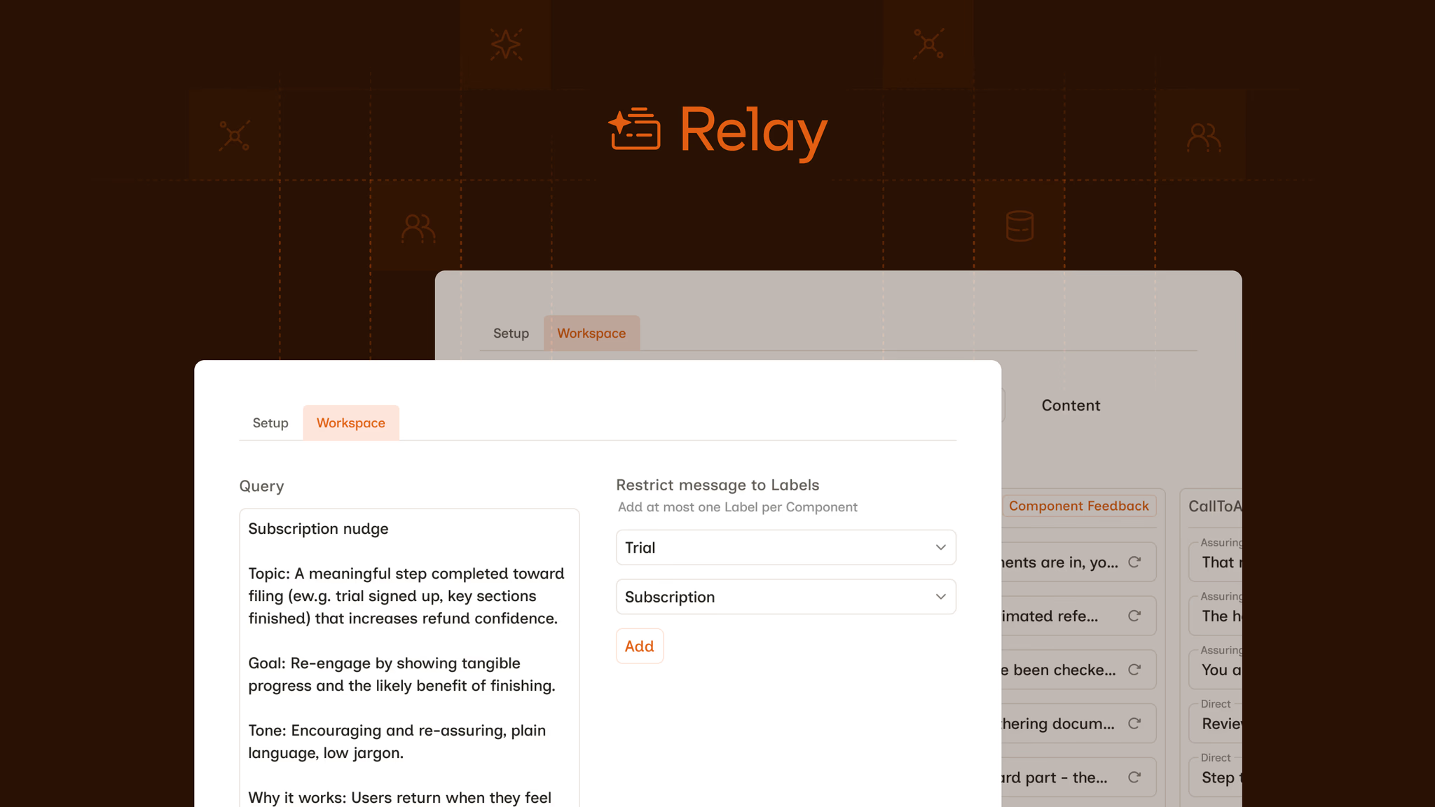
Relay is the core LLM copy engine. Prompt Shaper is the conversational builder upstream.
Scale
Full-page AI practice briefs — sticky sidebar + scrollable media stage. Type footer: bordered Matter.js box on desktop (>900px), layout-stable spawn; static full-width flex-wrap on tablet/mobile. Images: caption → alt; embeds: below-media figcaption. Desktop: metrics + image slides inset to 960px. Spec: docs/work-detail-page.md. Accordion (learnings on stage). Live Type D: Relay · Label Buddy · Product Synthesis and Discovery using Claude · Designing With an AI Agent · Prefix-First Design.
Work detail pages use global --festina-space-* aliases plus --work-detail-* semantics in colors_and_type.css. Full registry: #spacing-work-detail.
| Festina token | Value | Work detail use |
|---|---|---|
--festina-space-group-tab | 8px | Section kicker / Process label → body copy |
--festina-space-kicker | 12px | Sidebar column gap; intro → meta |
--festina-space-stack | 16px | Meta → sidebar CTA; metrics band inset; learnings divider |
--festina-space-group-break | 20px | Process item stack row gap; copy → Substack CTA |
--festina-space-section | 24px | Metrics band bottom padding; stage process band |
--work-detail-figure-gap | clamp(stack, 2.5vw, --detail-gap) | Inter-figure gap on scroll stage (page alias: --work-detail-space-figure) |
--work-detail-stage-media-max-w | min(960px, 100%) | Shared desktop content column — metrics band + image slides; inset via --work-detail-stage-inset-x |
--work-detail-type-tag-gap | 8px | Static type footer tag wrap (≤900px) |
| Token | Value | Use |
|---|---|---|
--work-detail-sidebar-w | min(272px, 26vw) | Sticky sidebar column width |
--work-detail-stage-bg | Cover-derived (Relay: #281003) | Media stage canvas |
--work-detail-pill-bg | color-mix(#000 14%, page-bg) | Type + tool pills in physics footer |
--work-detail-metrics-meta-height | calc(11px × 1.35 + 4px) | Scale/Results label row in paired grid |
| Caption policy | resolveShowcaseAltText() / resolveShowcaseStageCaption() | Images: JSON caption → img alt only. Embeds: below-media figcaption (optional stageCaption override) |
| Metrics grid | 6-row flattened + display: contents | Scale num+label in one cell; row pairs align with Results |
| Type physics footer | .work-detail-meta__physics-stage | 1px hairline border; layout-stable Matter boot; bottom flush to sticky sidebar |
| Embed facade | .work-detail-showcase__embed-facade | Glass play button; caption in aria-label + below-media figcaption; iframe loads on click |
Scaled preview — no Matter.js in Festina. Live pages use draggable type pills in the sidebar footer.
Scale
Results
Context is the product
Campaign context quality drives copy quality more than prompt wording alone.
content/ai-practices/popups/; renderer transforms at syncHTML framework diagrams baked to 1920×1080 PNG via Playwright — dark palette, NaN Jaune + Onest. Use for Type A/B scroll stacks and Type D cover slides (`.slide--cover` fill band). Type D article body uses live HTML instead — see Inline diagrams. Prefix-First PIL cover stays on its separate script. Full spec: docs/practice-infographic-component.md.
node scripts/generate-practice-diagrams.mjs --sync-media cowork-context
node scripts/generate-practice-diagrams.mjs --sync-media patches-agent
node scripts/sync-ai-practice-detail.mjscontent/ai-practices/diagrams/_shared/infographic-base.csscontent/ai-practices/diagrams/cowork-context/source.html + manifest.jsoncontent/ai-practices/diagrams/patches-agent/source.html + manifest.json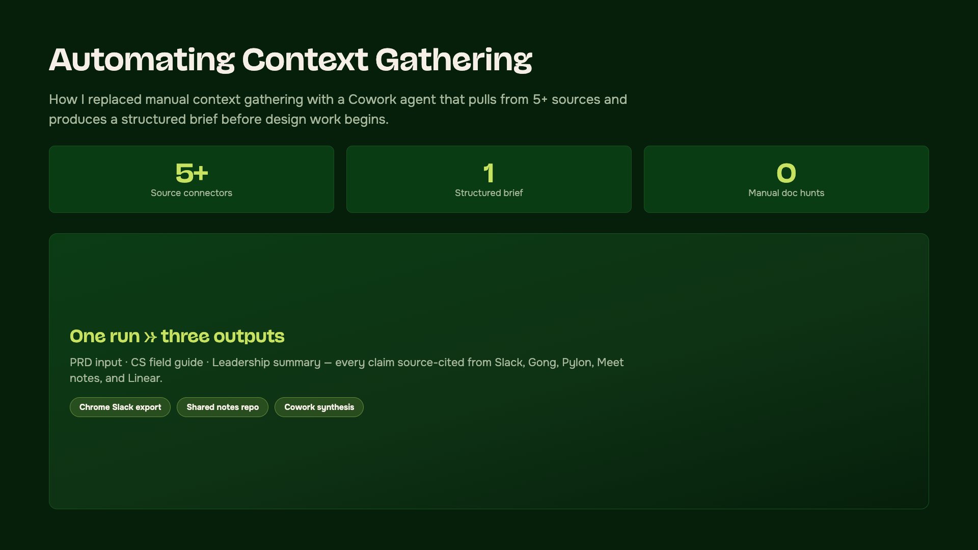
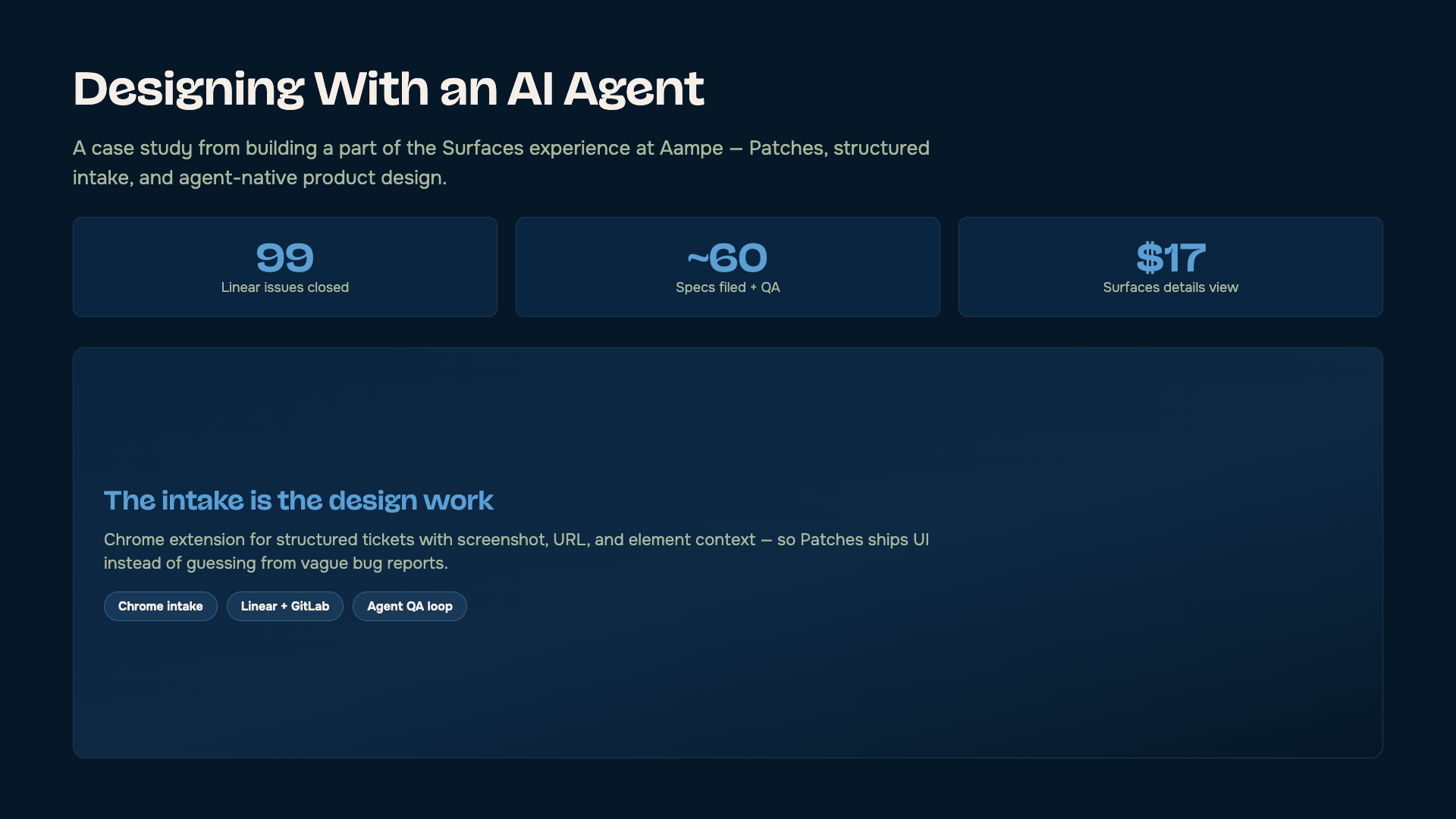
Live HTML framework diagrams inside Type D work detail articles — editable markup synced via sync-ai-practice-detail.mjs (no Playwright). PNG harness remains for hub covers and Type A/B scroll stacks. Full spec: docs/article-inline-diagram-component.md. Live: Product Synthesis and Discovery using Claude · Designing With an AI Agent · Prefix-First Design.
# Edit article HTML, then:
node scripts/sync-ai-practice-detail.mjs| Pattern | Classes | Use |
|---|---|---|
| Section diagram | .work-detail-infographic | Full-width block with top hairline |
| Inline under h2 | .work-detail-infographic--inline | Compact grids under a section heading — no extra top border |
| Screenshots | .work-detail-article__figure | Substack exports in article body |
| Editorial dek | .work-detail-article__dek | Stage headline — not the sidebar h1 |
content/ai-practices/articles/cowork-context.html — live article (Substack-aligned)content/ai-practices/articles/cowork-context-solution-draft.html — WIP solution/architecture (not live)coss-work-detail.css — .work-detail-infographic* + [data-detail-layout="article"] spacingStory-style project media — segment bars, title + counter, Expand control, collapsed autoplay, tap-to-open fullscreen Blossom carousel. Surfaces: Type A/B popups (content/ai-practices/media/*.json), About hero, and Harness Setup DIY diagrams (content/harness/diy-harness/media.json). Markup via scripts/lib/media-slideshow.mjs. Locked slides: hub popups use green+lime (slideshow); work detail pages use theme-adaptive styling (detail-stage) — see Locked access. Live: /work/ai → Label Buddy · /harness Setup slideshow.
| Piece | Selector / hook | Notes |
|---|---|---|
| Root | [data-media-slideshow] | One per popup; optional data-autoplay-ms |
| Inline track | [data-media-slideshow-inline] | Blossom carousel; slides need data-slide-title |
| Fullscreen | [data-media-slideshow-dialog] | One shared dialog per page; slides cloned on expand |
| Behavior | coss-media-slideshow.js | bindMediaSlideshows(scope) after modal mount |
| CSS | coss-media-slideshow.css | Slice — load with Blossom vendor on pages that use slideshows |
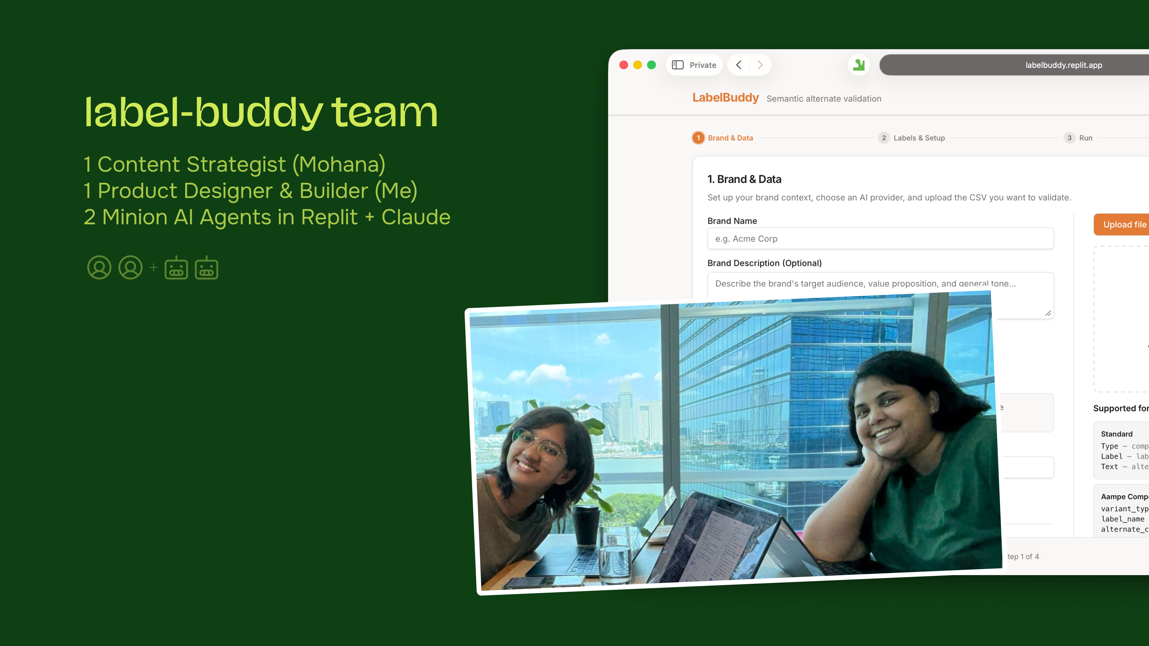
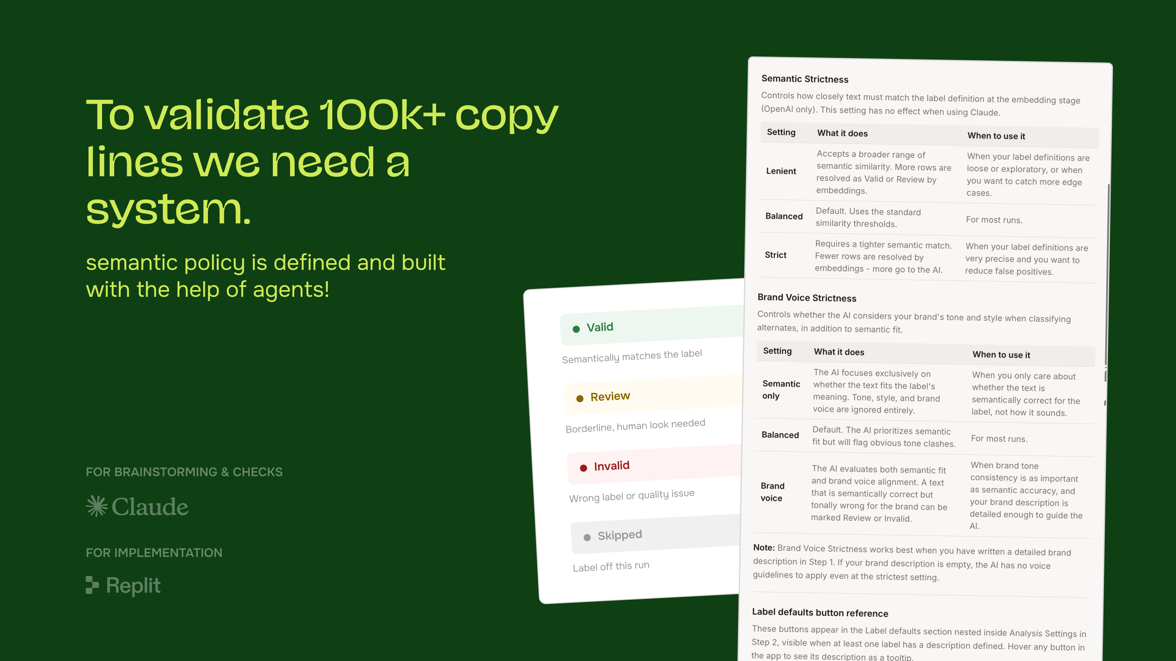
content/ai-practices/media/apps-aampe.jsoncontent/ai-practices/media/cowork-context.jsoncontent/ai-practices/media/email-variable-configurator.jsoncontent/ai-practices/media/label-buddy.jsoncontent/ai-practices/media/mangoes.jsoncontent/ai-practices/media/patches-agent.jsoncontent/ai-practices/media/prefix-first.jsoncontent/ai-practices/media/relay-prompt-shaper.jsoncontent/ai-practices/media/tiny-design-shop.jsonMedia block
Responsive sticker cover for case studies that are not public. Two render contexts: slideshow (hub popups — green field + lime badge) and detail-stage (work detail pages — theme-adaptive, no green field). Two statuses: locked (file + lock) and wip (hourglass). Content: content/ai-practices/locked-access.md.
| Piece | Selector / hook | Notes |
|---|---|---|
| Root | [data-coss-locked-access] | One cover per project slug |
| Context | data-coss-locked-access-context | slideshow (hub) · detail-stage (work detail page) |
| Cover | .coss-locked-access__cover | Built-in sticker; optional locked_image PNG fallback |
| Sticker | .coss-locked-access__badge | locked_badge in markdown; {project} = picker card title |
| Booking CTA | .coss-locked-access__cta | locked only — default Cal.com link; override with booking_url / booking_label |
| Icons | ph-hourglass-high · ph-file-text + ph-lock-simple | wip vs locked |
| CSS (hub) | coss-locked-access.css | Green field + lime sticker — load with coss-core.css |
| CSS (detail) | coss-work-detail.css | [data-coss-locked-access-context="detail-stage"] overrides — page --work-detail-* tokens |
Hub popup + hire slideshow context (data-coss-locked-access-context="slideshow"). Brand green field + lime sticker. Live: /work/ai → Tiny Design Shop popup.
More of details of this case study are under NDA
Book a callWork detail page context (detail-stage). Inherits page theme — no green field. Live: /work/aampe/ai/relay (last stage figure).
More of details of this case study are under NDA
Book a callIn progress — hourglass icon. Badge copy uses the picker card title for this slug (omit locked_badge or use {project}).
Interleap case study is in progress.
Full hire-page composite: .hire-content column → protruding folder tabs → practice picker panels → project popup shell. Click tabs to switch folders; click tiles to open a live popup demo. Spec: docs/practice-folders-hub.md. Production: /work/ai#practice-folders.
Designing where AI is the point — from model-first products like Relay to AI features on existing SaaS surfaces and the MVPs that prove them before an engineering sprint.
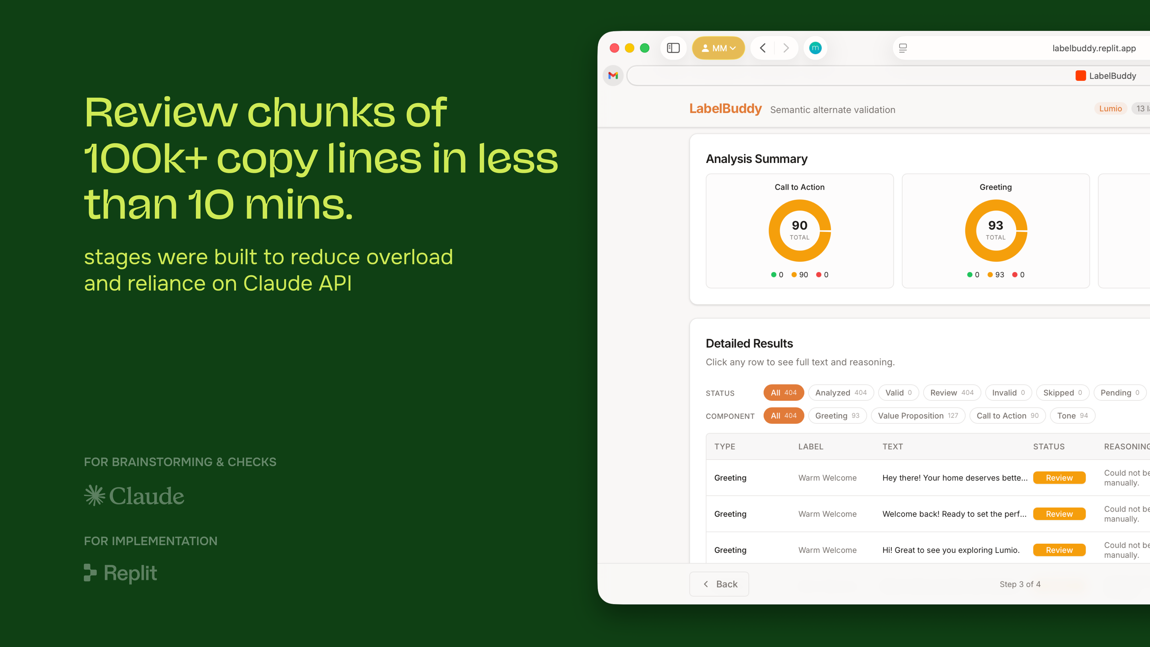
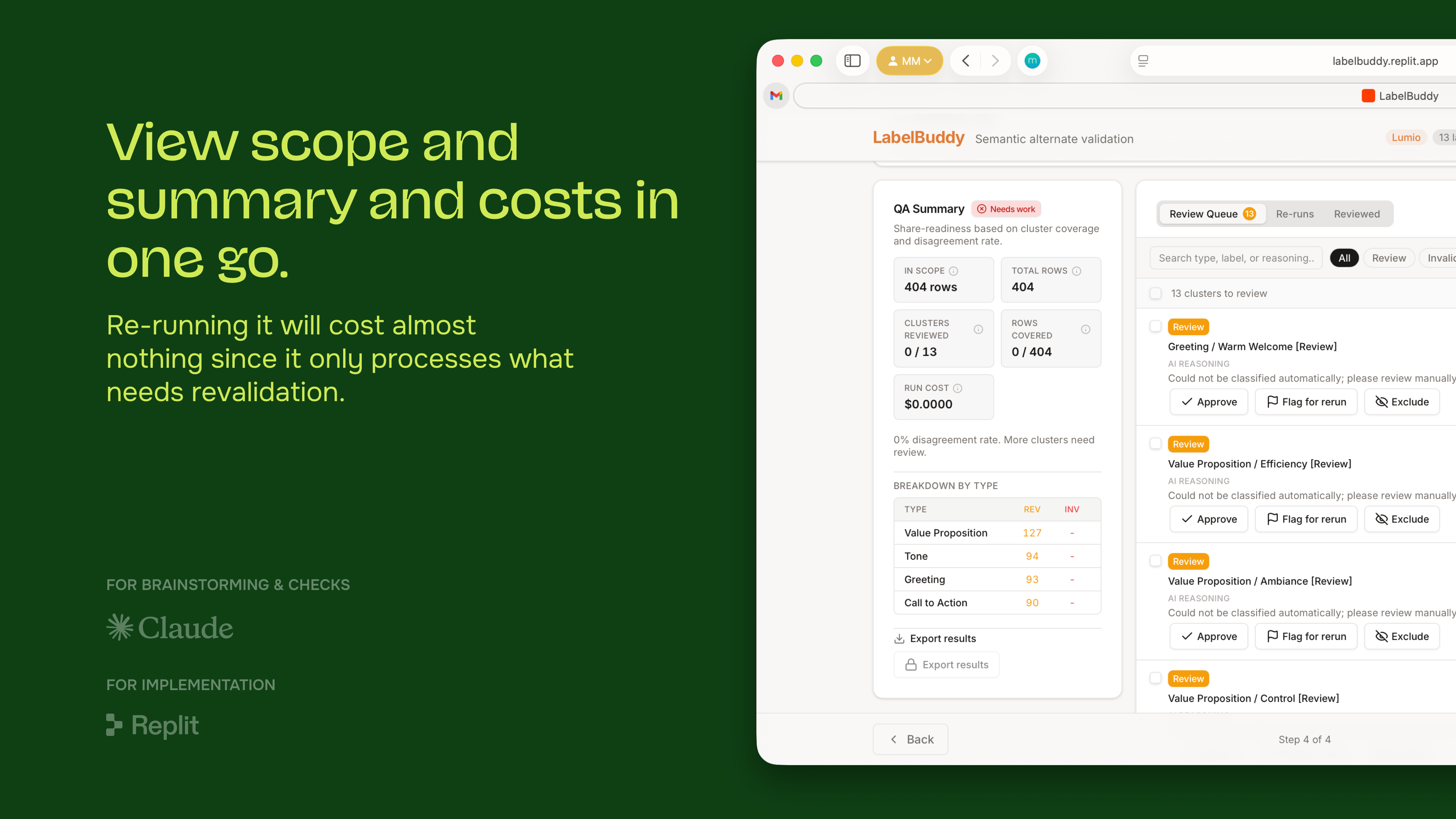
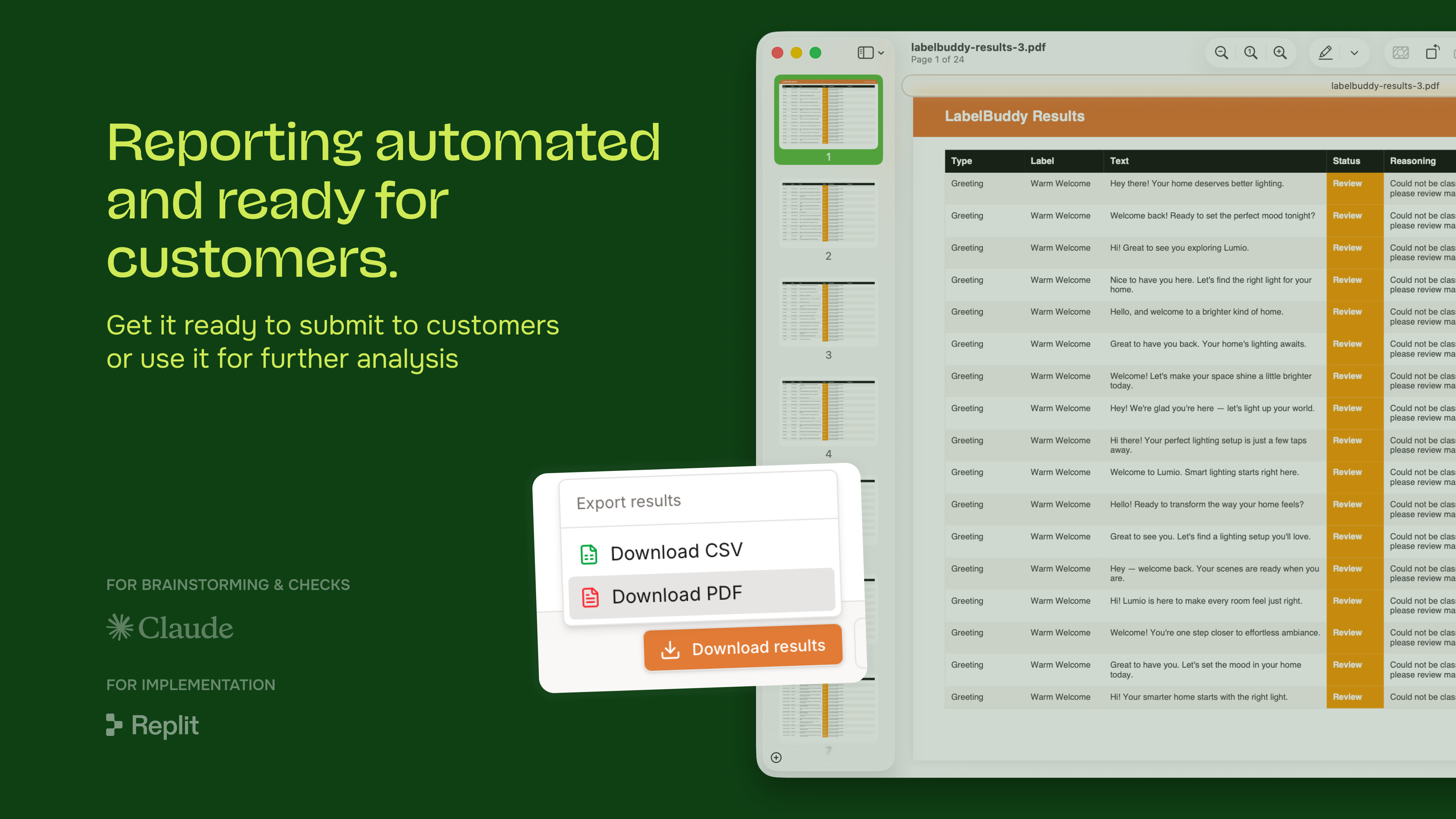
 Label Buddy
Agent QA — semantic label validation at ~100k copy lines
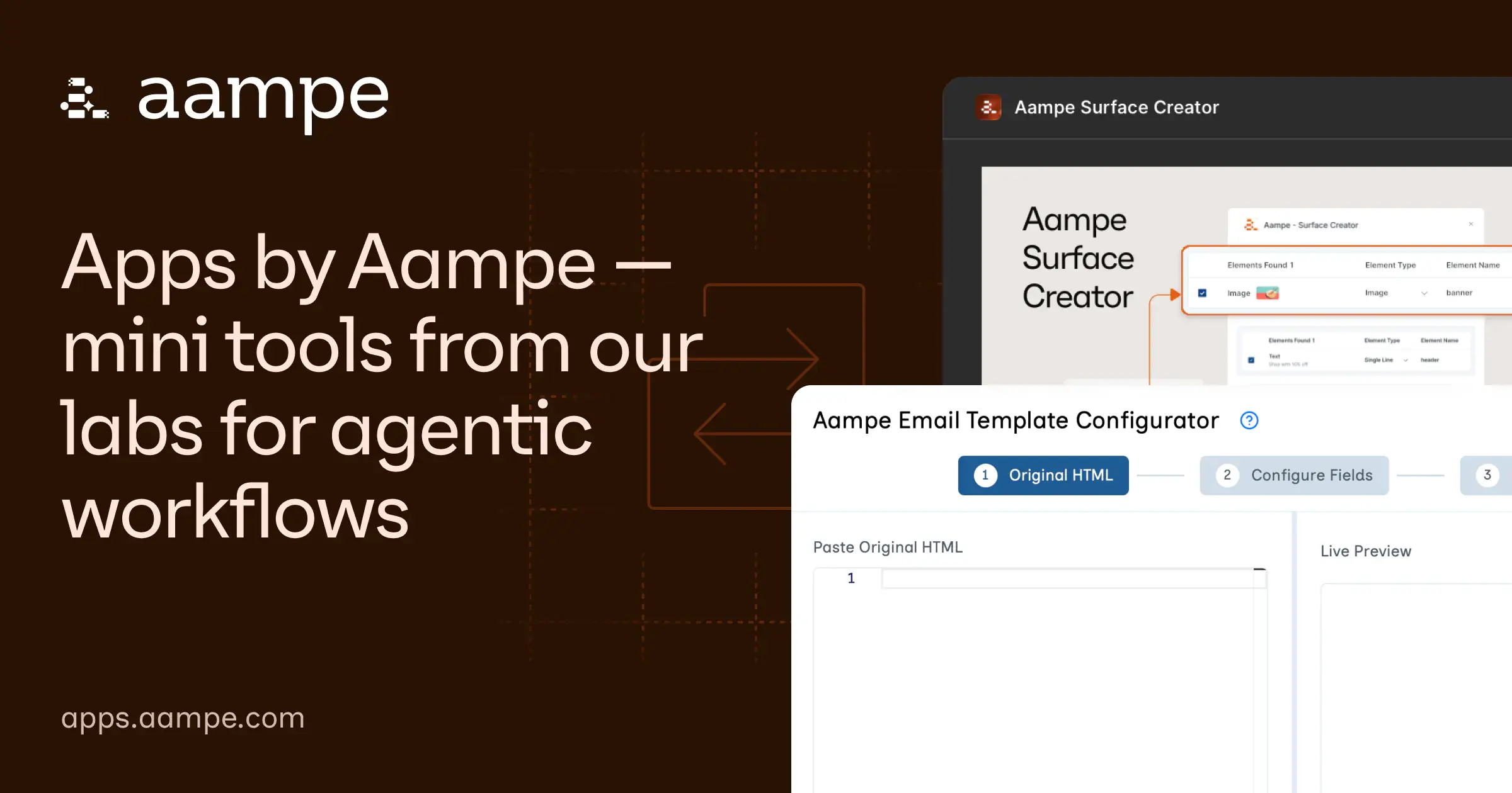
apps.aampe.com
Lightweight experimentation platform — 7+ tools shipped to real customers outside the sprint queue
Label Buddy
Agent QA — semantic label validation at ~100k copy lines
apps.aampe.com
Lightweight experimentation platform — 7+ tools shipped to real customers outside the sprint queue
Away from the core product, the same muscle shows up: take an idea to a live, shipped thing myself, with agents doing the build.
Systemic workflows that let a whole team make better decisions — context gathering, design systems an LLM can read, and customer signal turned into knowledge.
.hire-content inside .hire-pagesection.practice-folders[data-practice-folders] + ai-practices-folders.js[data-hire-practice-picker] per tab (live pages) or [data-festina-practice-hub-picker] (Festina demo)<template id="project-modal-panel-{slug}"> + bindHirePracticeModal() or Festina binder| File | Load on hub pages |
|---|---|
coss-core.css + coss-hire.css + coss-work.css | Folder chrome, picker, popup shell |
coss-interactions.js | Popup binders |
ai-practices-folders.js | Folder tab switching |
Hire-frame panel for a practice area: section title, lead copy, one or more featured project tiles with media (stacked when multiple), then secondary cards. Tiles open the project popup shell. On /work/ai, one picker per practice folder tab — three tabs on the live hub. Spec: docs/practice-picker-section.md. Live: /work/ai#ai-product-design.
Designing where AI is the point — from model-first products like Relay to AI features on existing SaaS surfaces and the MVPs that prove them before an engineering sprint.
.hire-section.hire-practice-section inside .coss-frame__panelp.hire-body between header and picker.hire-practice-primary with 16:9 media; first in DOM.hire-practice-picker__card stack; title + copy onlydata-hire-practice-picker per hub; tile slug matches popup template or fetchMap<a href="{share-url}"> with aria-haspopup="dialog"ph-corners-out in circular icon buttoncoss-hire.css only — page needs .hire-pageGrid of preview cards that open the hire testimonial drawer. Cards clamp to three lines; full quote + LinkedIn live in the drawer. Spec: docs/testimonial-card-grid.md. Live: /work/ai (4×2 grid) · /hire-me (2×4 in proof panel).
.hire-testimonials__stream (responsive grid)button.hire-testimonial-card.hire-testimonial-card--grid with data-hire-testimonial-open.hire-testimonial-card__quote (3-line clamp) + .hire-testimonial-card__cite.hire-testimonial-card__open + ph-corners-out (top-right)#hire-testimonial-drawer + bindHireTestimonialDrawer() in coss-interactions.js| Context | Desktop columns |
|---|---|
Full-width frame (#practices-testimonials on /work/ai) | 4 |
Proof panel (#testimonials on /hire-me) | 2 (.hire-frame__testimonials) |
| Tablet ≤900px | 2 |
| Mobile ≤520px | 1 |
| File | Load on live pages |
|---|---|
coss-hire.css | Card grid + drawer chrome |
coss-interactions.js | bindHireTestimonialDrawer() |
COSS card variant inside a CardFrame shell. CSS: coss-core.css. Spec: table-component.md. Live: /work-with-me.
| Model | Best for | Typical cadence |
|---|---|---|
| Fractional design lead | Ongoing product work | 1–2 days/week |
| Embedded sprint partner | Launch or reset | 2–6 weeks |
| Product systems advisor | Design systems, AI workflows | Monthly |
Compact three-column tool grid for the hire proof panel — favicon + name. Live: /hire-me#stack. Curated list in content/hire/proof/stack.md; URLs from content/colophon/overview.md via sync-hire-stack.mjs.
Design, product, and AI-assisted build tools I use day to day — tap to visit.
.hire-frame__stack.coss-frame__panel inside proof frameul.hire-stack__grid (3 columns desktop, 2 ≤520px)a.hire-stack__chip with DuckDuckGo favicon + .hire-stack__chip-label| Token | Use |
|---|---|
--festina-space-section | Gap between stack groups |
--festina-space-stack | Grid row gap |
--festina-space-kicker | Group title → grid; icon → label |
Vertical experience list inside the hire proof panel — logo, company · dates, tags, and short description. Live: /hire-me#work-timeline. Spec: hire-work-timeline-component.md. Source: content/hire/proof/work-timeline.md via sync-hire-work-timeline.mjs. Hire-only — not on /work/ai.

Head of Product & Design — hybrid IC and leadership shipping AI workflows, prototypes, Relay, and design ops for agentic MarTech.

Principal Product Designer & co-founder — led a team of 3 delivering sprint-based MVPs for AI, MarTech, Ed-Tech, and FinTech startups.
Head of Products & co-founder of India’s first no-code agency — Framer, Webflow, and Glide MVPs via design sprints.
ul.hire-work-timeline inside .hire-frame__work-timelineli.hire-work-timeline__item — 32px logo column + text column; top border except first row.hire-work-timeline__copy wraps .hire-work-timeline__head (meta + tags) and description.hire-work-timeline__company + .hire-work-timeline__dates on one line, middle-dot separated.hire-work-timeline__tags — muted keyword line.hire-work-timeline__desc — 1–2 sentences.hire-work-timeline__acquired — label + acquirer logo (optional acquired_by: slug in markdown)#work-previews panel above| Token | Use |
|---|---|
--hire-proof-item-pad | 16px padding above/below each row |
--hire-proof-item-col-gap | 16px logo → text column |
--hire-proof-meta-tight | 4px meta → tags inside __head |
--hire-proof-content-gap | 8px head block → description |
--hire-proof-logo-row-gap | 12px copy → acquired / client rows |
| Full registry: #spacing-hire · hire-spacing-harness.md | |
Vanilla COSS-adapted form controls — label, description, error, input, and textarea. Used by the private Resume ATS studio. Spec patterns from COSS Field / Input / Textarea; classes live in coss-core.css.
Input
Used in the downloaded PDF filename.
Textarea
Invalid + error
Incorrect password.
Private ATS resume tool at /studio/resume — direct-link only (noindex, nofollow, not in sitemap or site tree). Soft password gate, Markdown editor, keyword Tailor draft (no AI API), ATS letter preview, pdfmake ATS PDF export. Editor notes: resume-studio.md.
Unlock (soft gate)
Private tool
Enter the studio password to edit and export your ATS resume.
Editor + ATS preview
| Piece | Classes / files | Notes |
|---|---|---|
| Layout | .resume-studio, coss-resume-studio.css | Studio + this Festina panel only |
| ATS preview | .resume-ats-preview | Letter-like black Helvetica stack |
| Fields | .coss-field, .coss-input, .coss-textarea | See #field |
| Export | resume-studio.js + pdfmake | ATS-safe text layer (not browser print) |
| Live URL | /studio/resume | Password in docs/resume-studio.md |
Placeholder when a view has no content yet — icon, short title, and supporting description.
Nothing here yet
Saved items and drafts will show up in this panel once you add them.
Copyable command or short snippet — mono text in a bordered secondary panel. Spec: docs/code-block-component.md. Live: /skills#skills-install.
Single-line install
npx skills@latest add iruhdam1/skillsMultiline
node scripts/check-detail-page-design.mjs --surface skills --strict
node scripts/audit-design.mjsAnatomy
.coss-code-block — shell (border, secondary fill, radius).coss-code-block__pre + .coss-code-block__code — mono snippet.coss-code-block__copy + [data-coss-copy] — optional Copy (bound in coss-interactions.js).coss-code-block--multiline — wrap long scriptsHorizontal segmented controls for compact switches. Vertical orientation is live in this page’s left rail; underline is an alternate tab treatment.
Horizontal segmented
Horizontal with panels
Overview content — summary copy and entry points for the current section.
Details content — specs, lists, and supporting information.
Notes content — annotations, asides, or secondary context.
Vertical underline
Overview content — left rail tracks selection with an underline accent.
Details content — same panel pattern with a lighter tab treatment.
Notes content — useful for docs-style pages and settings layouts.
About the project
Relay is the core LLM copy engine. Prompt Shaper is the conversational builder upstream — the translation layer between marketer intent and model-ready input.
Results
About the project
Agent QA for semantic label validation at campaign scale — catches mismatches before copy ships.
About the project
Chrome extension intake + agent QA loop for shipping product UI through Patches — specs to closed issues in days, not sprints.
Scale
About the project
Solo app assembly line — agents handle build, locale, and SEO so each new tool inherits the same shipping shell.
Social links
Icon buttons on the dark footer band — same targets as the detail-page top bar.